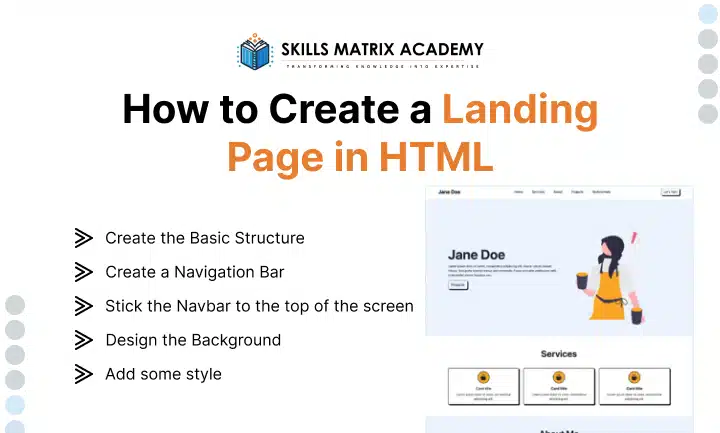
A strong full-page background makes your landing page stand out.
Place your background code just below the navbar, before closing the
element. Use a mask to overlay the image. This slightly darkens the background so your content stands out.(image)A masked background image draws attention without distracting from forms and headings. It also gives a professional, polished look to your landing page.
5. Add some style
Add some style. Now it’s time to make your page look great with CSS. Like HTML, CSS isn’t a programming language, and it’s pretty easy to learn.
In the next section, I’ll show you how to turn a plain HTML landing page into a visually appealing one with the magic of CSS.
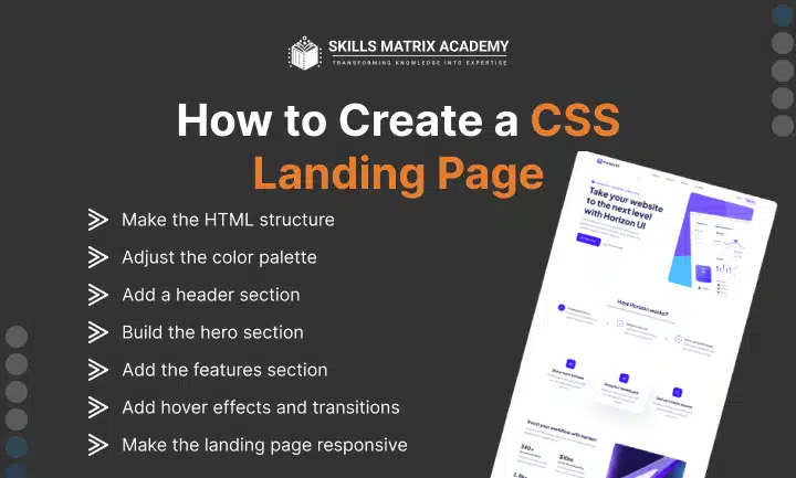
How to Create a CSS Landing Page
HTML works with CSS to change the style of elements on your landing page. With CSS, you can change background color, change text color, and change font type. These changes then cascade across elements, allowing you to update your entire simple landing page HTML code at once.
CSS can be written in the HTML file it applies to, or in a separate file called an external stylesheet. For this tutorial, I’ll use the latter method.
Create an empty text file called style.css in the same folder as index.html, and paste the following HTML code in between thetags inside index.html:
This HTML instructs the document to reference the style.css file for styling instructions.
Next, open style.css, paste in this CSS code, and save the file:
This will provide a placeholder background image for the landing page. Setting the height at 100% ensures that background elements cover the entire screen.
Even after this CSS, the landing page may still look generic. At this point, you can populate the page with content and style it to match your business branding.
Key Styles to Focus on When Adding CSS
You can use CSS to change the look of your page. Here are the main styles to focus on:
●Colors: With CSS, you can change text colors and background colors for block elements or the entire page. See our guide to CSS colors for more details.
●Fonts: Fonts are crucial for a landing page. They make your text professional-looking and readable. Choose a font family based on branding, and adjust font size to establish hierarchy.
●Margins and Padding: CSS allows you to space out elements using margins and padding. White space improves the look of your landing page, making it clean and digestible, which is key when optimizing landing pages.
1. Make the HTML structure.
Like I mentioned before, you can’t build a CSS web page without HTML. First, you need a solid HTML structure. Then, you can layer CSS to bring life, color, and movement.
Without CSS, it’s just a simple landing page HTML code. It works, but it’s flat. Add CSS, and suddenly your page looks dynamic.
For example, let’s style the navbar HTML with some CSS code:
●.navbar { background-color: #007bff !important; } → Set the navbar background to blue.
●.navbar-brand, .nav-link { color: #fff !important; } → Make the navbar brand and navbar links white.
●.dropdown-menu { background-color: #007bff; } → Matches the dropdown menu with the navbar.
●.form-control { width: 250px; } → Keeps the search bar consistent.
Run this through your code editor or builder, and you’ll instantly see a fulfilled structure with an appealing background color.
2. Adjust the color palette.
I used a blue-and-white theme for a clean, professional design. Here’s the original color palette:
●Primary Blue (#007bff): Navbar background & dropdown menu.
●Darker Blue (#0056b3): Dropdown item hover effect.
●White (#ffffff): Navbar text and links.
●Light Gray (#dfe6e9): Link hover effect.
Now, say you want something closer to the HubSpot color palette. Here’s what that looks like:
●Primary Orange (#ff7a59): Navbar background & dropdown menu.
●Dark Blue (#2e475d): Dropdown background.
●Light Blue (#00a4bd): Dropdown hover & search bar border.
●White (#ffffff): Navbar text and links.
●Light Gray (#f5f8fa): Link hover effect & background shade.
Update your CSS with these values, and your website navigation bar now matches HubSpot’s branding style.
3. Add a header section.
The header section is the first thing users interact with. It shows your brand identity and offers clear navigation.
A strong header makes it easier for visitors to move around your landing pages. It also improves user experience and overall accessibility.
4. Build the hero section.
The hero section is one of the most powerful parts of your landing page. It usually includes:
●A large background image
●A title that grabs attention
●A short description
●A strong call-to-action button
This section sets the tone. If it’s clear and bold, users feel motivated to take action right away.
5. Add the features section.
The features section breaks down your product or service benefits. A smart layout makes it easy for users to scan.
Use a grid layout for better readability. Highlight unique selling points. This not only improves conversion rates but also builds trust.
At this point, your landing page should have the following structure:
6. Add hover effects and transitions.
Hover effects and transitions make a website feel more interactive. They give users instant visual feedback when they hover over buttons, links, or cards. In CSS, you can add these effects using the: hover pseudo-class.
Let’s apply some hover effects and transitions to make the landing page more engaging and dynamic.
Check the parameters below if you’d like to adjust the hover effects and transitions to match your personal style:
●Links (.nav-links a: hover): Change to orange (#ff4500).
●Buttons (.btn: hover): Darker orange (#e63e00) + slight growth.
●Feature Boxes (.feature: hover): Move up (-5px) with stronger shadow.
●Smooth Transitions (.btn, .feature): Apply effects over 0.3 seconds.
These micro-interactions turn a flat site into an interactive website that users enjoy.
7. Make the landing page responsive
A responsive website adapts to all screen sizes. That means it looks great on desktops, tablets, and mobile devices.
Why does this matter? Because 92.3% of traffic comes from mobile. A mobile-friendly website boosts user engagement and Google search rankings.
Use media queries in your CSS. They let you control how elements appear on different devices. Test on multiple screen sizes to ensure the best experience.
HTML Landing Page Tools
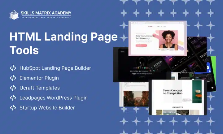
Building landing pages doesn’t need to be hard. With the right HTML Landing Page Tools, you can create responsive landing pages that look great and convert fast.
1. HubSpot Landing Page Builder
The HubSpot landing page builder is free to start. You can design professional pages, run A/B tests, and test landing pages across devices. It also integrates with CRM to collect visitor data and manage leads easily.
2. Elementor Plugin
Elementor is a drag-and-drop WordPress plugin with 300+ Elementor templates. It lets you create pages without coding. Plans start at $49/year, giving you flexibility and full design control.
3. Ucraft Templates
Ucraft landing page templates are free and simple to use. They help you generate leads and publish web pages quickly. Perfect for small campaigns or startups.
4. Leadpages WordPress Plugin
With the Leadpages WordPress plugin, you can use templates or upload your own custom HTML landing page. It’s ideal if you want control over design and fast testing.
5. Startup Website Builder
A startup website builder is a no-code website builder. It comes with pre-designed blocks powered by Bootstrap to launch Bootstrap responsive pages quickly.
Some CSS & HTML Landing Page Templates
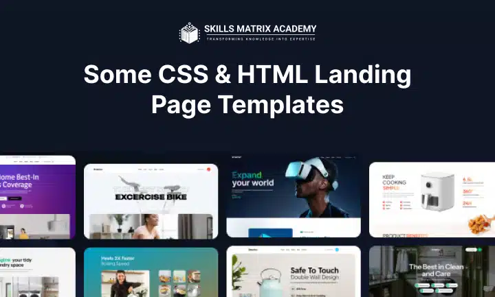
Coding from scratch gives you the most flexibility when building a landing page. But starting from zero can be time-consuming.
That’s where CSS landing page templates and HTML landing page templates save the day. These templates give you ready-made landing page code you can customize. You save time, build faster, and still create professional designs.
Let’s explore some of the best landing page templates you can use right now.
1. OnePage
Overview:
●Free options available
●Paid versions up to $49
●Built with the latest Bootstrap
●Fully SEO optimized landing page
The OnePage landing page template is versatile. It’s designed with a clean, neutral color scheme and well-structured sections.What makes it great is its responsive landing page design. It works smoothly on both desktop and mobile landing pages without breaking the layout.
Another plus is its simplicity. This beginner-friendly landing page comes with comments in the code. You know exactly where to edit, which saves time. If you’re a business person or freelancer wanting a quick build, this template is a solid choice.
Best for: Small businesses, startups, creative agencies, and freelancers.
What I like: OnePage is lightweight and fast-loading. It feels smooth on any device and delivers a great user experience.
2. Simple Conversions
Overview:
●Comes with a photo, customizable text, and a short form
●Add more content below the fold if needed
The Simple Conversions landing page is all about focus. Bloated designs often distract visitors from forms and CTAs. This template fixes that. It’s built as a clutter-free landing page. You avoid unnecessary distractions, keeping the spotlight on your offer.
Customization is simple. Add icons, edit the form, or adjust elements to match your brand. This simple landing page design is perfect when you want results fast.
Best for: Marketers, freelancers, sales teams, startups, and small businesses.
What I like: It’s effortless. You can easily tweak the customizable text landing page and resize it as needed. It’s quick, effective, and user-friendly.
3. Open Pro
Overview:
●Built with Tailwind CSS
●One-time $49 payment
●Works across desktops, tablets, and mobile devices
●Available in HTML, Vue, Figma, Next.js, and Sketch
The Open Pro landing page is a strong pick for SaaS companies. It lets you showcase services in a sleek, professional way.
Customization is flexible. You can edit in the HTML landing page, the Vue landing page, or design in the Figma landing page. Prefer frameworks?
You can use the Next.js landing page or the Sketch landing page. You also get extras like banners and MP4-compatible backgrounds. That gives your site a premium feel.
One feature that stands out is the landing page with testimonials. Real customer stories add trust and boost engagement.
Best for: SaaS startups, Web companies, tech sites, and IT website landing pages.
What I like: The bold, modern layout. The dark layout landing page design feels polished and premium, making your site stand out.
4. Focus
Overview:
●Uses bright, eye-catching colors
●Simple, easy-to-edit design
Looking for a vibrant look? The Focus landing page is modern, colorful, and easy to customize.
You can set up in minutes. Add a headline, form fields, a short description, and a photo. Upload your assets, and you’re ready to go.
If you’re already using HubSpot, you’ll love the integration. It works seamlessly with the HubSpot landing page template.
Best for: Startups, small businesses, creative agencies, and personal brands.
What I like: The bright color landing page instantly grabs attention. Plus, it’s fast to edit and publish.